Logo Design
Girdie Golf is an interactive golf gambling game that partners with golf courses to give players an extra layer of fun and engagement while on the course. The name is inspired by the golf term “GIR” (Greens in Regulation). The founders wanted a brand that felt fun and energetic, yet sophisticated enough to align with upscale golf environments.
Their creative direction centered on developing “fun yet professional” branding inspired by the Lacoste logo — something sleek, minimal, and versatile enough for apparel. They were also intrigued by the idea of incorporating a giraffe icon as a playful nod to the acronym “GIR.”
Their creative direction centered on developing “fun yet professional” branding inspired by the Lacoste logo — something sleek, minimal, and versatile enough for apparel. They were also intrigued by the idea of incorporating a giraffe icon as a playful nod to the acronym “GIR.”
My Role
With limited initial direction, I led the concept exploration and design development, translating broad ideas into distinct visual directions. I created multiple logo concepts that balanced approachability and refinement while experimenting with iconography, typography, and form.
With limited initial direction, I led the concept exploration and design development, translating broad ideas into distinct visual directions. I created multiple logo concepts that balanced approachability and refinement while experimenting with iconography, typography, and form.
Refined Exploration
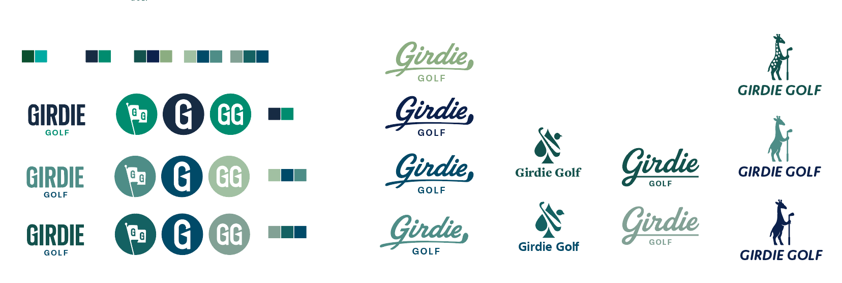
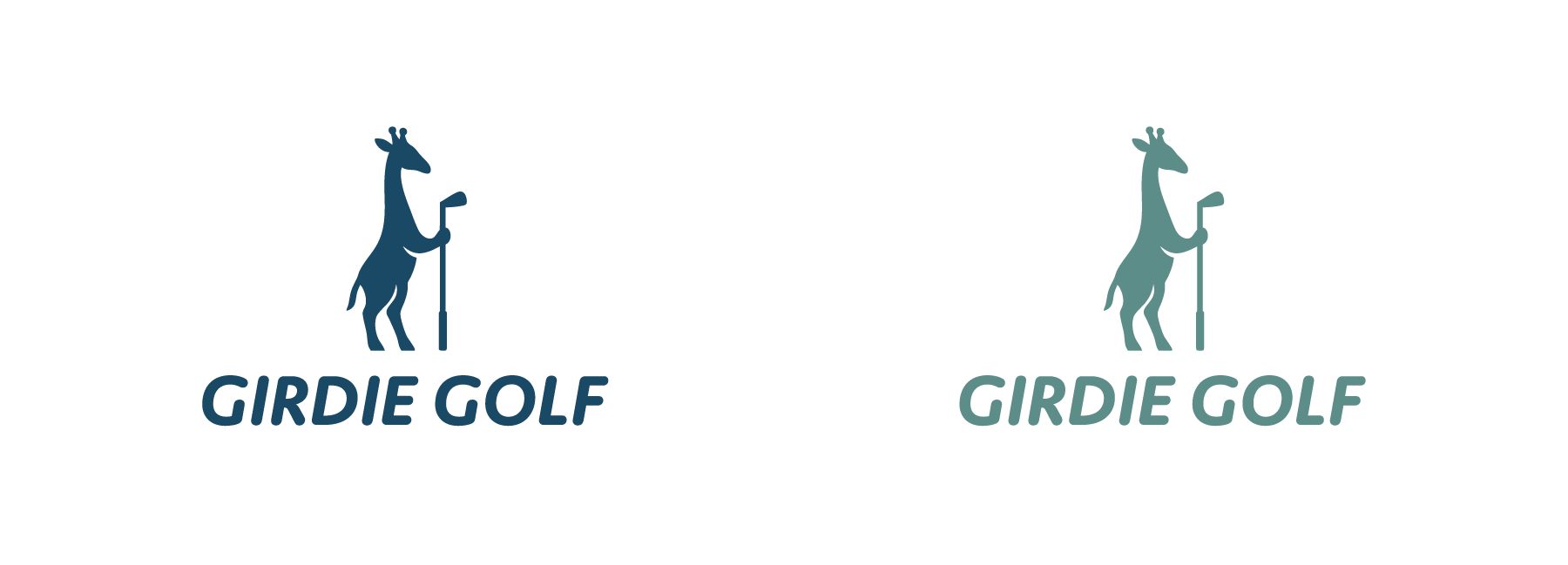
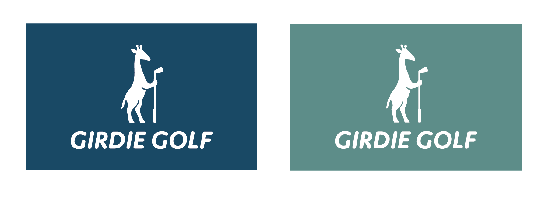
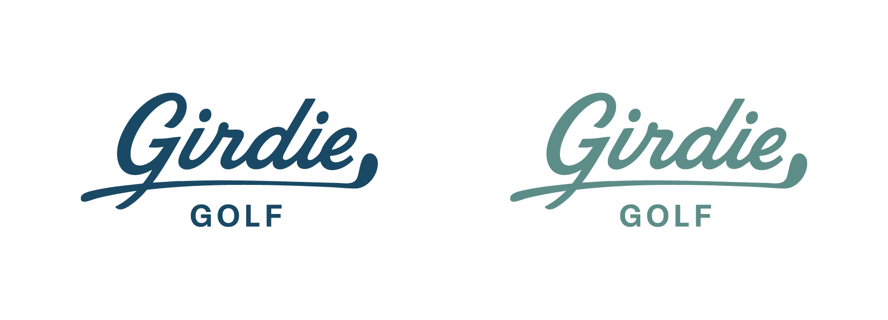
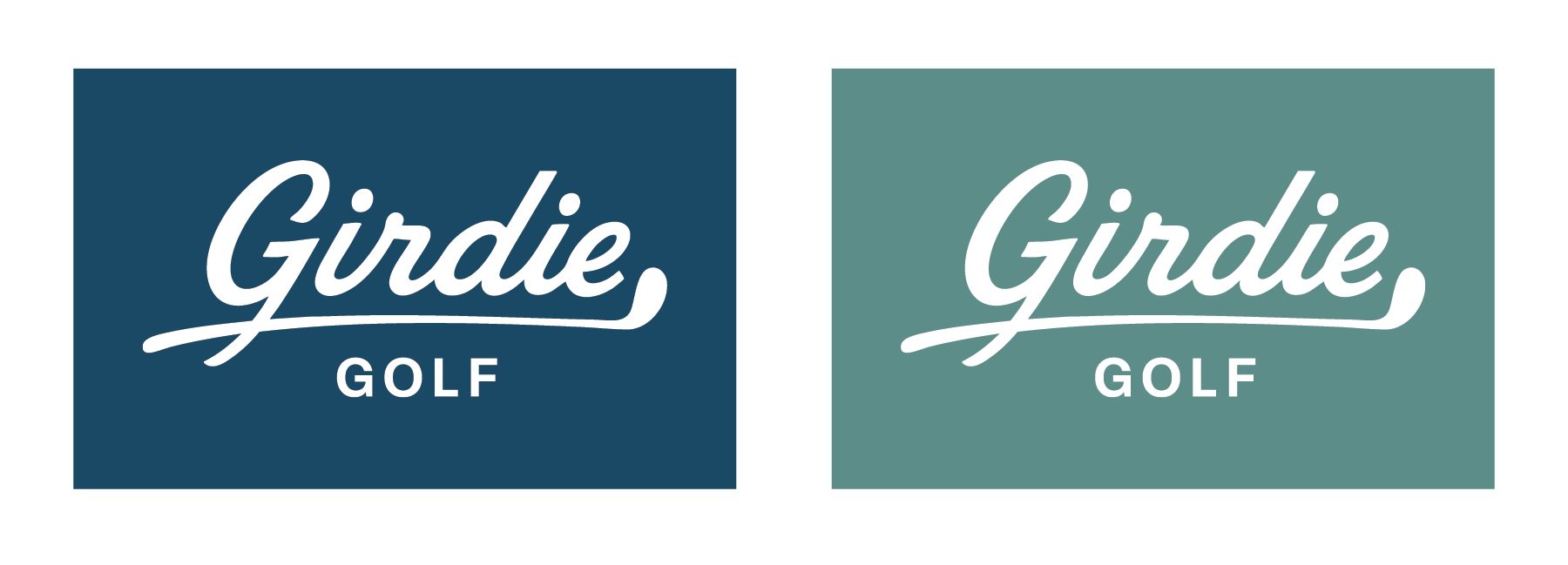
After the preliminary exploration, we narrowed the options to three final concepts supported by a teal-and-green color palette that reflected both freshness and sophistication.
Logo Concept 1
Logo Concept 2
Logo Concept 3
Outcome
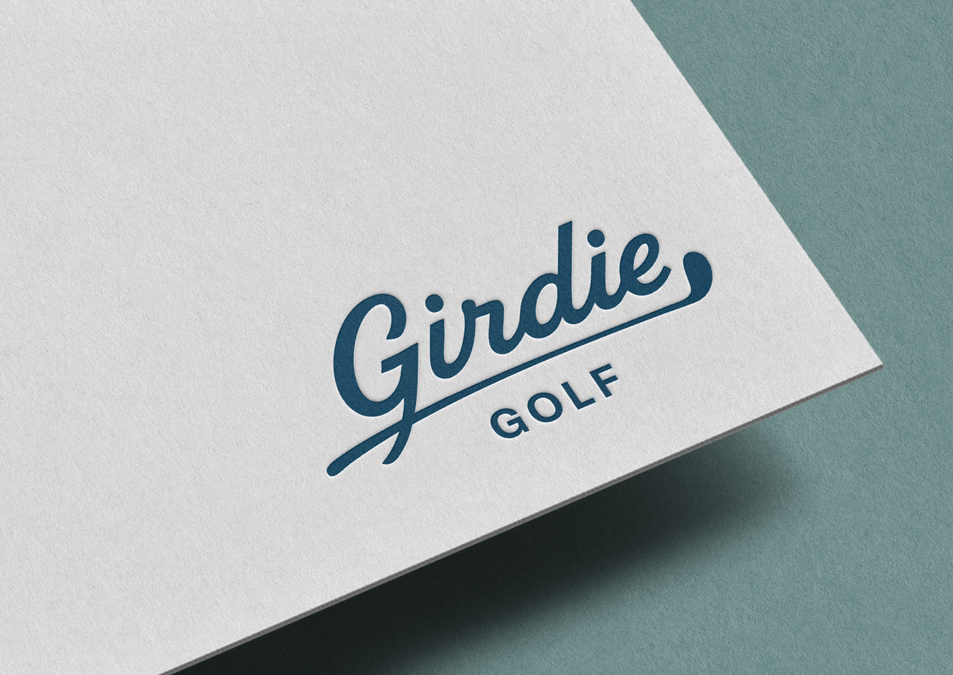
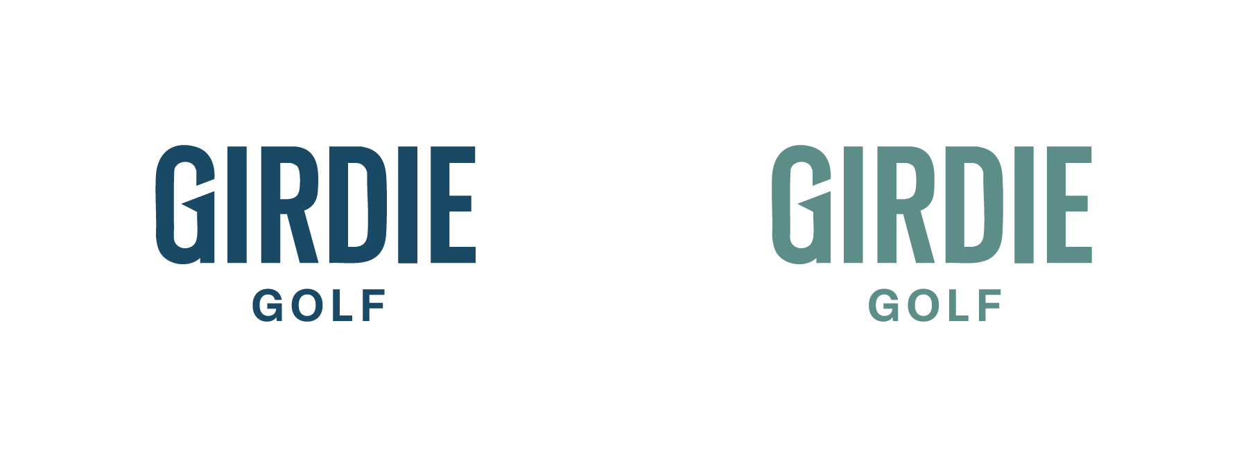
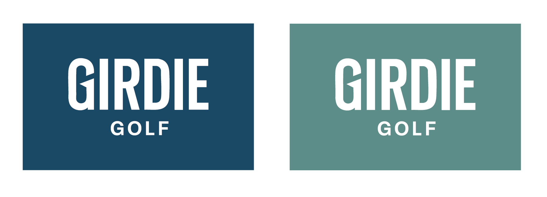
Following collaborative feedback rounds, the founders selected Concept 3 as the final logo. The chosen design captures Girdie Golf’s playful yet polished identity, positioning the brand as approachable for everyday golfers while maintaining the elevated tone needed to partner with high-end courses.
Following collaborative feedback rounds, the founders selected Concept 3 as the final logo. The chosen design captures Girdie Golf’s playful yet polished identity, positioning the brand as approachable for everyday golfers while maintaining the elevated tone needed to partner with high-end courses.